They are called Dark Patterns — today also renamed “deceptive patterns” — are everywhere but we hardly notice them. Understanding what are dark patterns It serves a dual purpose: to protect users and to prevent companies from using them, as they are currently expressly prohibited in Europe. They are the dark side of UI and UX, interface elements designed to disorientate the user and lead him to perform unwanted actions or to discourage some of his choices.
Index
- Some examples of dark patterns
- How many types of dark patterns are there?
- The new dark patterns you should know about
- Is it legal to use dark patterns?
- Why it's best to avoid them (even for business)
Some examples of dark patterns
- The microscopic unsubscribe link in the footer of a newsletter
- a hard to notice X or clicking on a popup
- An extra product or service added to your cart during checkout
- Messages that want to make our choices seem stupid"No thanks, I don't want to save money”
These are just a few examples of the dark patterns we interact with on a daily basis when we browse or purchase products. For us at BIGFIVE User Experience is important. Because of this let's avoid including them in the our works.



In this video you will find some famous examples of dark patterns, such as the very complicated procedure for cancel your Amazon account. Spoiler: it's really, really hard.
How many types of dark patterns are there?
To date they are known 12 different categories of user experience manipulation.
Trick questions
By filling out a form you answer a question that leads you to give an unwanted answer. At a quick glance, the question seems to ask one thing, but if read carefully it asks another entirely.
Sneak into Basketball
You attempt to purchase something, but somewhere along the way the site places an additional item in your cart, often through the use of a checkbox or hidden link.
Roach Motel
When the signup/registration process is very simple, but then it is very difficult to get out of it (for example a premium subscription).
Zuckering Privacy
You are tricked into sharing more information about yourself publicly than you really want to. It is named after Facebook CEO Mark Zuckerberg and the Cambridge Analytica scandal
Price Comparison Prevention
When the site or app makes it difficult to compare the price of one item to another, thus making it difficult to make an informed decision.
Misdirection
The design tries to draw your attention to one thing to distract it from another.
Do you want a website that converts without deceiving anyone?
We design ethical and transparent user experiences that convert more and build trust, without gimmicks.
Hidden Costs
When you reach the last step of the checkout process you discover unexpected charges, e.g. shipping costs, taxes, etc.
Bait and Switch
You set out to do one thing, but instead a different or opposite thing happens.
Confirmshaming
The act of blaming the user for opting for something. The option to decline is worded in such a way as to make the user feel ashamed of making a certain choice.
Disguised Ads
Ads disguised as other types of content to trick you into clicking on them.
Forced Continuity
When your free trial with a service comes to an end and your credit card begins to be silently charged without any warning. In some cases the situation gets even worse making it difficult to cancel the subscription.
Friend Spam
The product asks for your email or social media permissions under the guise that it will be used for a desirable outcome (e.g. finding friends), but then spams all your contacts in a message claiming to be from you .
The new dark patterns you should know about
Since 2021, the list has grown: the industry's leading website (deceptive.design, the successor to deceptive.design (formerly darkpatterns.org)) catalogs dozens of variations. Here are the most popular ones that have emerged in recent years.
Nagging
Insistent and repeated requests—activate notifications, download the app, rate the service—recur with every visit until the user, exhausted, gives in. Consent obtained through exhaustion is not a choice.
False urgency and fake scarcity
Countdowns that restart with every visit, always the same "last 2 rooms available," "12 other people are looking at this product": urgency and scarcity invented to force impulse buying.
Preselection
Boxes already checked for you: the newsletter, extra insurance, marketing consent. Anything pre-selected for the benefit of the seller (and not the user) is a dark pattern—and under the GDPR, pre-set consent is invalid.
Deceptive cookie banners
The giant, colorful “Accept all” next to a gray “Reject,” hidden or behind three clicks: this is the most widespread dark pattern on the European web, so much so that the EDPB guidelines and the Italian Data Protection Authority specifically mention it.
Is it legal to use dark patterns?
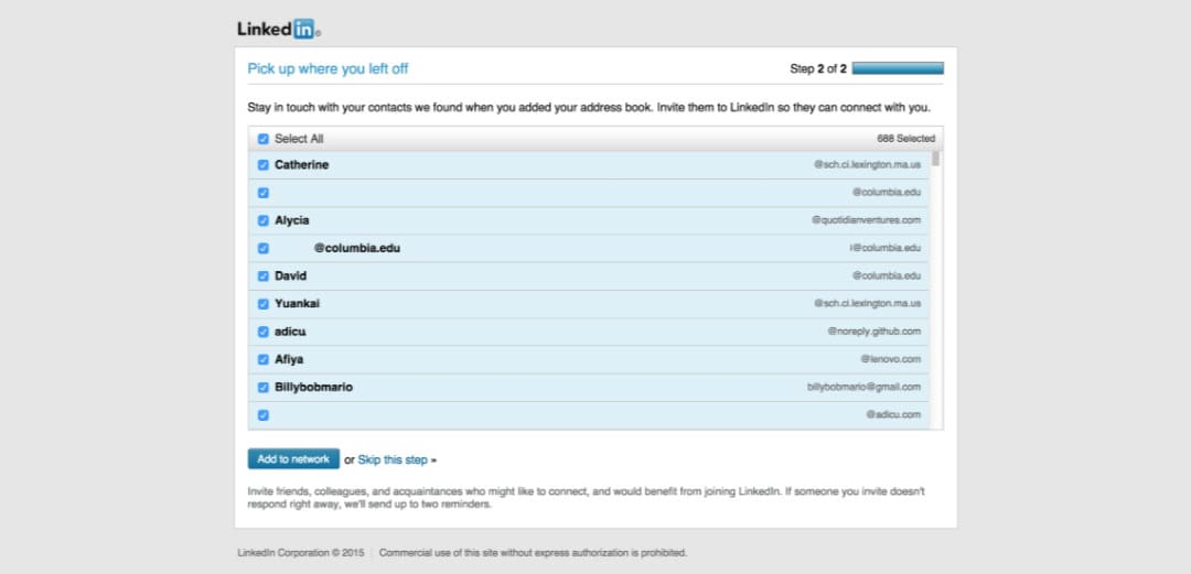
The answer here has changed radically in recent years. For a long time, dark patterns occupied a gray area, punished only in high-profile cases—the most famous being LinkedIn, fined $13 million for its system that forced the invitation of contacts. Today, this is no longer the case: Digital Services Act (art. 25) expressly prohibits online platforms from having interfaces that deceive or manipulate users; EDPB guidelines and the Privacy Guarantor sanction patterns that undermine consent (including cookie banners); and Consumer Code It allows the Italian Competition Authority (AGCM) to target them as unfair commercial practices—with fines that in recent years have reached millions of dollars, even in Italy. In short, using dark patterns today isn't just unfair, it's a real legal risk.
Why it's best to avoid them (even for business)
Beyond the legal risk, dark patterns are a terrible business: they inflate short-term metrics (registrations, impulse sales) and destroy the ones that matter—returns, cancellations, negative reviews, and repeat customers. Trust is the most expensive asset to rebuild. That's why, for us at BIGFIVE, ethical user experience isn't just a matter of principle: a clear and honest interface converts better over time, because customers stay.
TO KNOW MORE
deceptive.design (formerly darkpatterns.org)
The Hall of Shame of dark patterns on Twitter
Do you want to create your site with a web agency that knows all the secrets of the web?
Request a free quote


